
Revenue and Profit at Amazon - Monday Makeover
Background
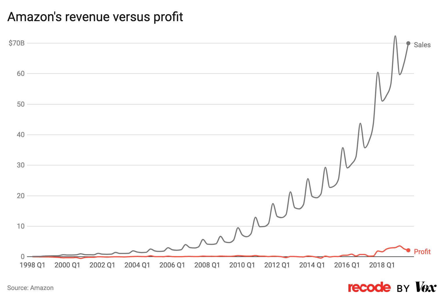
This week's Makeover Monday visualization was originally publish in a Vox article, "Amazon’s tiny profits, explained", by Rani Molla. The article focus on the growth strategy that Amazon has utilized to great success. Molla writes, "Amazon intentionally posts low profits because it takes the vast majority of the money it earns and invests it right back into the company so that it will profit all the more in the future."Dataset and Original Visualization
The original data was published on the Macrotrends website (Amazon's Quarterly Revenue and Amazon Quarterly Profit.) The original visualization was the lead chart in the Vox article.
What does the original visualization hope to convey?
The original visualization conveys how revenue at Amazon has risen quickly but profits have stayed relatively low (although any company with profits in the billions is doing pretty well!)What works well?
It is clear from the visualization that profit has not had the same pattern of growth over time as revenue. Revenue has been rising quickly and profit has stayed low. Also, overall, the chart is relatively uncluttered.What could be better?
Here the adage "Less is more" can be aptly applied. The visual aspect that catches and holds my attention is the cyclic revenue pattern. This is really not the point of the chart. The quarterly fluculations in revenue are not revealing anything particularly important when it comes to the comparison of revenue and profit. The use of data at the quartely level also leads to clutter in the x-axis. And it is not possible to get detailed information about both revenue and profit when hovering over a data point.Goals for the redesign
My goal was to create a chart that was uncluttered and provided the view with complete understanding of the information with just a glance. I sought to examine the impact of aggregating the data at level of year, not quarter. It was my hypothesis that annual data with a trend line could quickly and cleanly convey the information.The redesign

Design Decisions
Although I did not label it on the chart, I referred to it in the title for the chart "Exponentially Increasing Revenue and Slowly Increasing Profit at Amazon." In their book, "#Makeover Monday", Andy Kribel and Eva Murray write that the chart title should "very specific [and] clarify what ... [was] analyzed and the conclusions"
Future Design Enhancements
The original graph provide a bit more detail when profits dipped below zero. With additional time, I might explore it this could be achieved in my redesign, but again the relatively small fluculations in profit were not the main communication goal of the chart.Online Resources
Two things that I learned about during this redesign were: