World Happiness - A Makeover Monday Challenge
Background
The World Happiness Report is a “landmark survey of the state of global happiness that ranks 156 countries by how happy their citizens perceive themselves to be."Dataset and Original Visualization
https://data.world/makeovermonday/2020w19-world-happiness-report-2020
 Original Visualization from World Happiness Report.
What does the original visualization hope to convey?
This horizontal stacked bar visualization is showing two things: countries in rank order of their average ‘ladder score’ (from 2017-2019) and how much six different measures “contribute to that country’s ladder score”.This chart actually continues on for two more panels showing the results for 153 countries. (Not sure why the chart shows 153 and the report mentions 156 in its overview.)
What works well in the original visualization?
- The ordering of the countries works well. It is easy to see the top and bottom countries in the survey.
- It is colorful in a way that draws the eye.
- I like the vertical lines denoting the whole number integers associated with the score.
What could be better?
- Because each country is on its own line, it is impossible to quickly ‘get the big picture’ on how scores vary around the world.
- The importance of the difference in the amount of explained scores is not apparent (the six bars). Why does it matter? And can I really compare the explained variation across countries using this visualization? It is not easy.
- I thought the number that followed each country’s name was the number of respondents in thousands. It was only later that I realized it was the ladder score for that country.
- Although ‘happiness’ is a term that has been used in the branding of this report for many years, I’m not sure how I feel about having the ladder score be represented by construct of ‘happiness’.
- The rightmost segment (light purple) each bar represents a statistical treatment of the data which then covers the remaining, ‘unexplained’ portion of the ladder score in each country. (From the report, “The residual simply represents that part of the national average ladder score that is not explained by our model.”) I feel like giving the statistical treatment its own color is a bit confusing to the reader. A neutral grey would have been a better choice.
Goals for the Redesign
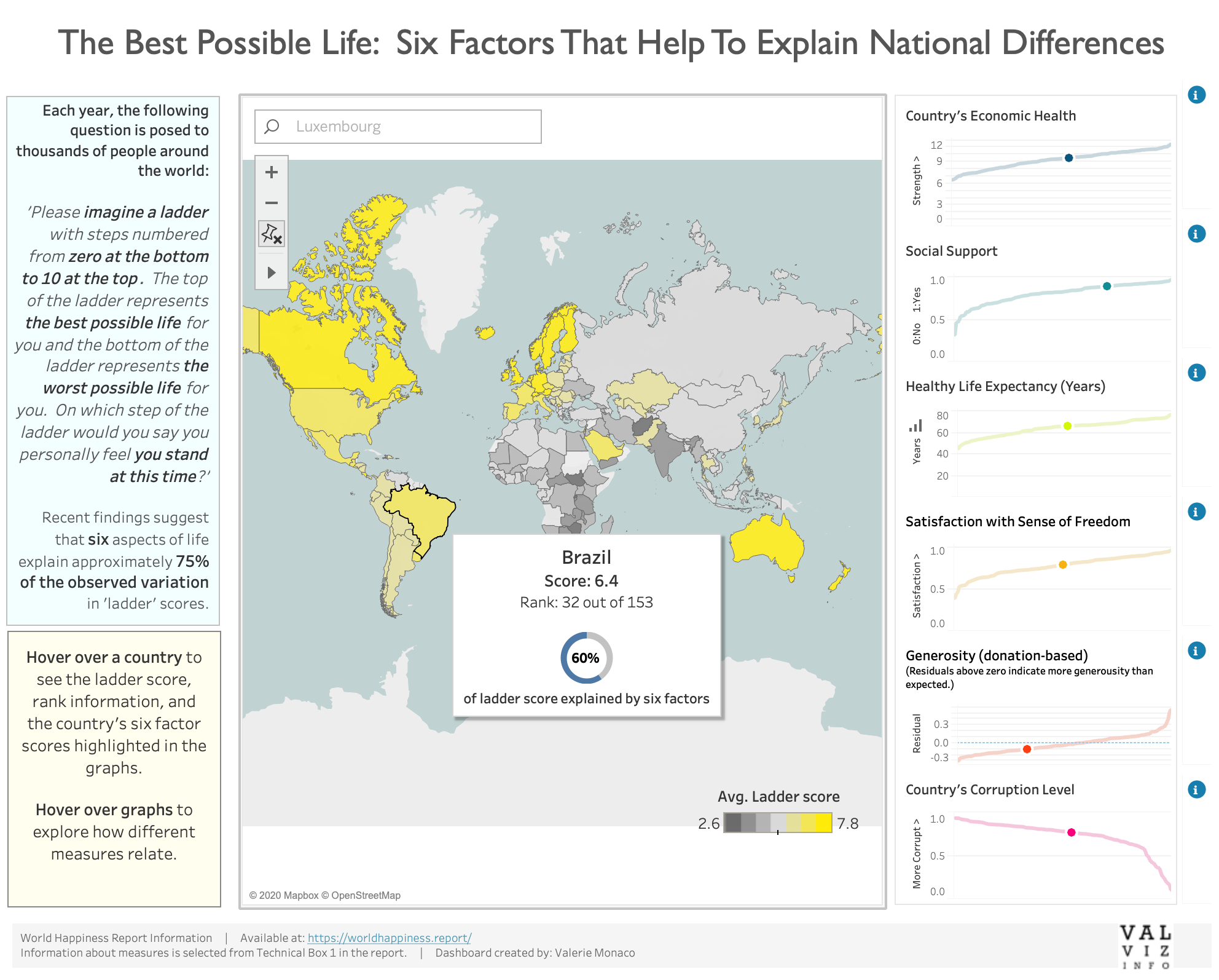
I wanted to take the dataset and create a dashboard to promote exploration and empathy.- Allow the user to explore the data using an interactive dashboard.
- Include map and graphs permit hover over highlighting actions
- Use a choropleth map to visually show ladder score values around the world and to allow users to see geographic patterns.
- Create an opportunity for empathy by showing raw scores on the six factors for each country on hover.
Redesign
View Interactive Dashboard
Design Decisions
- I created a custom palette for the choropleth map. Bright and sunny yellow for countries with higher ladder scores versus gray and gloomy for countries with lower ladder scores.
- For the six line graphs, I stuck with the same colors used in the original visualization. I imagined walking through this redesign with the report owners and helping them get oriented to the new design. They are a bit bright on their own, but I think work ok in the highlighter mode.
- I stacked the graphs to allow for easy comparison of ranking for a country across the six factors.
- I avoid the use of the word 'happiness' in order to stay true to the original intent of the ladder score.
Future Design Enhancements
Although I am pleased with the match between my goals of exploration and empathy and the current state of the dashboard, there are still things I would work on changing (with unlimited time).- Although I worked hard to create the donut chart, I think it has too much visual weight in the tool tip. Perhaps a horizontal stacked bar would be a better choice.
- I don’t like dashboard actions completely. You can lose context when you go from map to graphs and cannot click on a graph point to select a county across the charts and map.
- With the colors I selected for the choropleth map, it is hard to distinguish between countries without data and countries in the middle of the happiness continuum.
Future Questions To Explore
- While hovering over the graphs, some outliers in the pattern of generosity caught my eye. I’m curious to understand more about the role of charitiable giving across different countries.
- Although this dataset does not contain trends over time, the data from other years is available. Understanding more about how ratings and ladder scores have varied over time could be explored through additional visualizations.